Cannonical Component Analysis on sample datasets
Skills- sklearn, scipy, seaborn, CCA, statistics
Introduction
Canonical correlation analysis is used to identify and measure the associations among two sets of variables. Canonical correlation is appropriate in the same situations where multiple regression would be, but where are there are multiple intercorrelated outcome variables
The goal of this toy project was to use new statistical and visualization libraries to conduct CCA on sample datasets. The libraries and functions used in this project include: scikit-learn and scipy for linear decomposition and conducting Canonical Componenet Analysis and seaborn for new visualization tecniques.
I will try to perform canonical correlation analysis (CCA) between the two datasets X and Y. Dataset X contains time series x1, x2, x3, and dataset Y contains time series y1, y2, y3.
The following analysis was done:
a) Load CCA dataset, and split into the X and Y data to carry out analysis
Original Data
| x1 | x2 | x3 | y1 | y2 | y3 |
|---|---|---|---|---|---|
| 1.530845 | 0.316551 | -1.823282 | 1.215005 | 1.273343 | 0.026177 |
| 1.285960 | 0.823623 | -1.389774 | 1.579516 | 0.621029 | 0.804732 |
| 0.106213 | 0.578572 | 0.564672 | -0.018080 | -1.103449 | 1.082170 |
| -0.937513 | 0.040444 | 1.064561 | -1.748572 | -1.387991 | -0.676495 |
| -1.516770 | -1.462519 | 1.001928 | -0.673814 | 0.430090 | -1.128205 |
Data is split into X and Y
n1,n2 = np.shape(data)
xdata = data.iloc[:,:3] # xdata has three variables, 200 observations
ydata = data.iloc[:,3:]  # ydata has three variables, 200 observations
t = range(n1)
b) Plot the time series in 2-D space
plt.figure(figsize = (10,10))

plt.subplot(3,2,1)
plt.plot(xdata.iloc[:,0])
plt.title('x1')

plt.subplot(3,2,3)
plt.plot(xdata.iloc[:,1])
plt.title('x2')

plt.subplot(3,2,5)
plt.plot(xdata.iloc[:,2])
plt.title('x3')

plt.subplot(3,2,2)
plt.plot(ydata.iloc[:,0])
plt.title('y1')

plt.subplot(3,2,4)
plt.plot(ydata.iloc[:,1])
plt.title('y2')

plt.subplot(3,2,6)
plt.plot(ydata.iloc[:,2])
plt.title('y3')

plt.tight_layout()
plt.show()
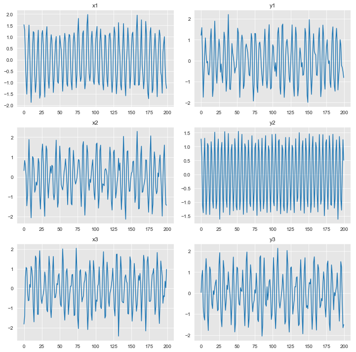
c) Plot the time series in 3-D space
fig = plt.figure(figsize=(16,6))

ax = fig.add_subplot(121,projection='3d')
ax.scatter(xdata.iloc[:,0],xdata.iloc[:,1],xdata.iloc[:,2],c=t)
plt.title('x space')

ax = fig.add_subplot(122,projection='3d')
p = ax.scatter(ydata.iloc[:,0],ydata.iloc[:,1],ydata.iloc[:,2],c=t)
plt.title('y space')
cbar = fig.colorbar(p)
cbar.set_label('time')
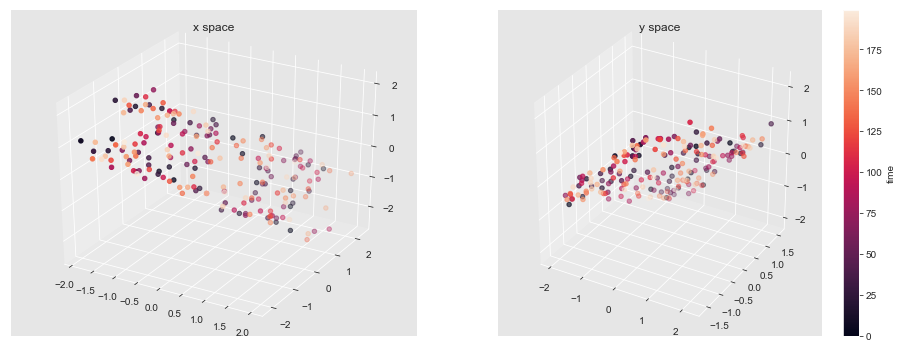
d) Perform CCA on the dataset and plot output.
To perform PCA I normalized the data, then used the CCA function from sklearn library.
n_modes = 3 #modes to keep
cca = CCA(n_components=n_modes,max_iter = 10000)
U,V = cca.fit_transform(xdata,ydata)
A = cca.x_weights_
B = cca.y_weights_
F = np.cov(xdata.T)@A
G = np.cov(ydata.T)@B
r = [np.corrcoef(U[:,ii],V[:,ii]) for ii in range(n_modes)]


plt.figure(figsize=(10,6))
for kk in range(n_modes):

    plt.subplot(n_modes,3,kk*3+1)
    plt.plot(F[:,kk])
    plt.title('F: Mode ' + str(kk+1))

    plt.subplot(n_modes,3,kk*3+2)
    plt.plot(G[:,kk])
    plt.title('G: Mode ' + str(kk+1))

    plt.subplot(n_modes,3,kk*3+3)
    plt.plot(U[:,kk])
    plt.plot(V[:,kk])
    plt.title('U and V: r = ' + str(r[kk][0][1])[:4], fontsize = 18)
    plt.legend(['U','V'])

plt.tight_layout()
plt.show()

FM1=F[:,0]  #Mode 1
FM2=F[:,1]  #Mode 2
FM3=F[:,2]  #Mode 3

GM1=G[:,0]  #Mode 1
GM2=G[:,1]  #Mode 2
GM3=G[:,2]  #Mode 3
F:
[[ 0.00446775 | 1.38448709 | 0.74085775]
[ 0.36774811 | 1.18278841 | 0.65839886]
[ 0.35360286 | -1.20036722 | -0.64154713]]
G:
[[-0.60781613 | 1.04238248 | -0.11125062]
[-1.21694479 | -0.0053953 | 0.14002947]
[ 0.62447444 | 1.02810331 | -0.23102376]]
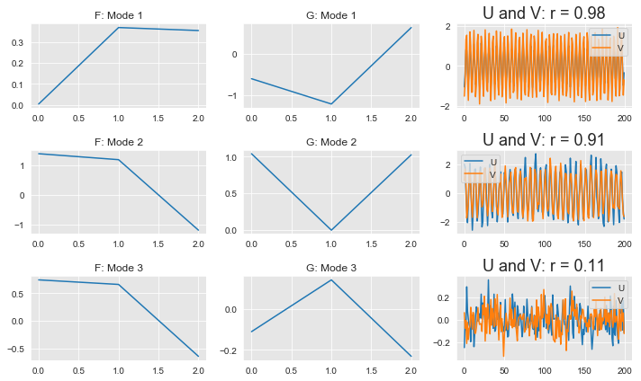
e) Plot vectors that correspond to the modes of high correlation in the 3-D x-space and in the 3-D y-space
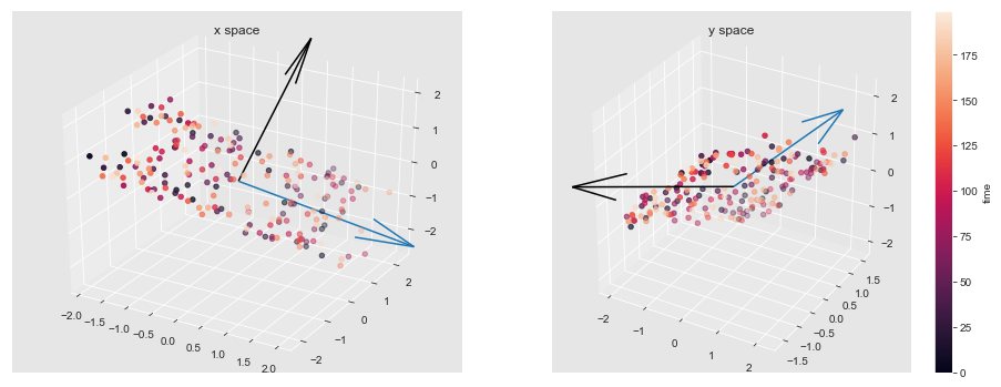
Plot vector F1 and vector F2 in x-space, and G1 and G2 in y-space since the first 2 modes have high correlation The black arrows are F1 and G1 which represent Mode 1 of the CCA, and blue arrows (F2 and G2) represent Mode 2.
fig = plt.figure(figsize=(16,6))

ax = fig.add_subplot(121,projection='3d')
ax.scatter(xdata.iloc[:,0],xdata.iloc[:,1],xdata.iloc[:,2],c=t)
ax.quiver(0,0,0,FM1[0],FM1[1],FM1[2],length=4,normalize=True,color='black')    #vector F1
ax.quiver(0,0,0,FM2[0],FM2[1],FM2[2],length=4,normalize=True)    #vector F2

plt.title('x space')

ax = fig.add_subplot(122,projection='3d')
p = ax.scatter(ydata.iloc[:,0],ydata.iloc[:,1],ydata.iloc[:,2],c=t)
ax.quiver(0,0,0,GM1[0],GM1[1],GM1[2],length=4,normalize=True,color='black')    #vector G1
ax.quiver(0,0,0,GM2[0],GM2[1],GM2[2],length=4,normalize=True)    #vector G2
plt.title('y space')
cbar = fig.colorbar(p)
cbar.set_label('time')
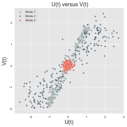
f) Plot U(t) vs V(t) where U is the canonical scores of the X data and V is the canonnical scores of the Y data
plt.figure(figsize=(6,6))
flatui = ["#95a5a6", "#34495e", "#e74c3c"]
sns.set_palette(flatui)

sns.scatterplot(x=U[:,0],y=V[:,0],marker='D',edgecolor="0.9",linewidth=.5, alpha=.75)
sns.scatterplot(x=U[:,1],y=V[:,1], marker='+',linewidth=1.5, alpha=.75)
sns.scatterplot(x=U[:,2],y=V[:,2], marker='o',edgecolor="1", linewidth=.5, alpha=.75)

labels=['Mode 1','Mode 2','Mode 3']
plt.title(' U(t) versus V(t)',fontsize = 18)
plt.xlabel('U(t)',fontsize = 18)
plt.ylabel('V(t)',fontsize = 18)
plt.legend(labels)
plt.tight_layout()
plt.show()
Mode 1 has the highest r value of 0.98 and hence the highest correlation. This is seen in the plot below (grey diamonds), where the data points for Mode 1 show the smallest deviation and follow a narrow positively increasing trend. The second significant mode is Mode 2 (r=0.91). It has some more spread than Mode 1 (the + markers) but still shows a positive correlation between the U and V markers. Mode 3 is just a cluster in one spot, and shows lowest correlation as predicted by the r value of 0.11. It does not follow any linear trends.
g) Plot F (only the significant modes) in 2-D (e.g. x1 vs x2; x1 vs x3; x2 vs x3) to see whether the vectors F (i.e. F1, F2, …) point in the same direction as PCA eigenvectors of this dataset. Investigate the same for G in y-space
In order to investigate this I carried out PCA on the T and x datasets so that CCA is finding modes which explain non-negligible fractions of total variance.
pca_input_x = xdata
n_modes_x = np.min(np.shape(xdata))
pca_x = PCA(n_components = n_modes_x)
PCs_x = pca_x.fit_transform(pca_input_x)
eigvecs_x = pca_x.components_
fracVar_x = pca_x.explained_variance_ratio_
The same PCA method as above was carried out on the y datasets
pca_input_y = ydata
n_modes_y = np.min(np.shape(ydata))
pca_y = PCA(n_components = n_modes_y)
PCs_y = pca_y.fit_transform(pca_input_y)
eigvecs_y = pca_y.components_
fracVar_y = pca_y.explained_variance_ratio_
When I plot the eigen vectors from the PCA and the significant modes from the CCA in the same plot, the plots in the x-space have the vectors lining up perfectly, which indicates that they explain a lot of the variance in the x-space and are highly correlated. The vectors in the y-space are less correlated. Even though some remain in the direction of the variance, there is less correlation between the modes. This would suggest that overall there is larger variance in the x space.
