Principal Component Analysis on sample datasets
Skills- sklearn, scipy, seaborn, PCA, statistics
Introduction
Principal component analysis, or PCA, is a dimensionality-reduction method that is often used to reduce the dimensionality of large data sets, by transforming a large set of variables into a smaller one that still contains most of the information in the large set.
The goal of this toy project was to use new statistical and visualization libraries to conduct PCA on sample data. The libraries and functions used in this project include: scikit-learn and scipy for linear decomposition and conducting Principal Componenet Analysis and seaborn for new visualization tecniques.
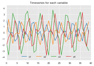
The first sample dataset contains time series of four variables: x1, x2, x3 and x4.
The following analysis was done:
a) Plot the time series for each variable.
plt.figure(figsize=(10,5))
sns.set_style("darkgrid", {"axes.facecolor": ".9"})
ax = df.plot()
ax.set_title('Timeseries for each variable')
ax.legend(frameon=False, loc='lower center', ncol=len(col_names))
ax.axis([0,40,-4.5,4.5])
plt.savefig('1a')

b) Perform PCA on the data.
To perform PCA I normalized the data, then used the PCA function from sklearn library.
#normalize data and check it out
data_norm = (df - df.mean())/df.std()
## Run PCA
n_modes = np.min(np.shape(data_norm))
pca = PCA(n_components = n_modes)
PCs = pca.fit_transform(data_norm)
eigvecs = pca.components_
fracVar = pca.explained_variance_ratio_
n=2
print(np.sum(fracVar[:n])*100)  #sum of the first n modes = total percent variance explained by the first n eigen vectors
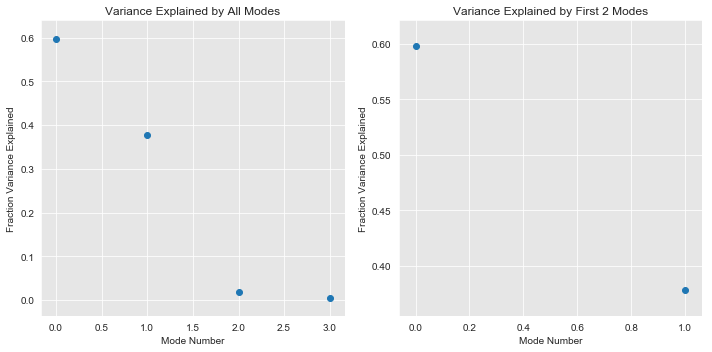
c) Plot fraction of variance explained by each mode, and keep significant modes to reconstruct the data
plt.figure(figsize=(10,5))

plt.subplot(1,2,1)
plt.scatter(range(len(fracVar)),fracVar)
plt.xlabel('Mode Number')
plt.ylabel('Fraction Variance Explained')
plt.title('Variance Explained by All Modes')

plt.subplot(1,2,2)
n_modes_show = n
plt.scatter(range(n_modes_show),fracVar[:n_modes_show])
plt.xlabel('Mode Number')
plt.ylabel('Fraction Variance Explained')
plt.title('Variance Explained by First ' + str(n_modes_show) + ' Modes')
plt.tight_layout()
plt.show()
Using the plots below I decide which modes I want to keep to reconstruct the data. I keep the first 2 modes because they explain 97.6% of all the variance. Eventhough there is a drop off after the first mode, the reason I kept the first two was because just the first one explained only 59.8% of the variance.

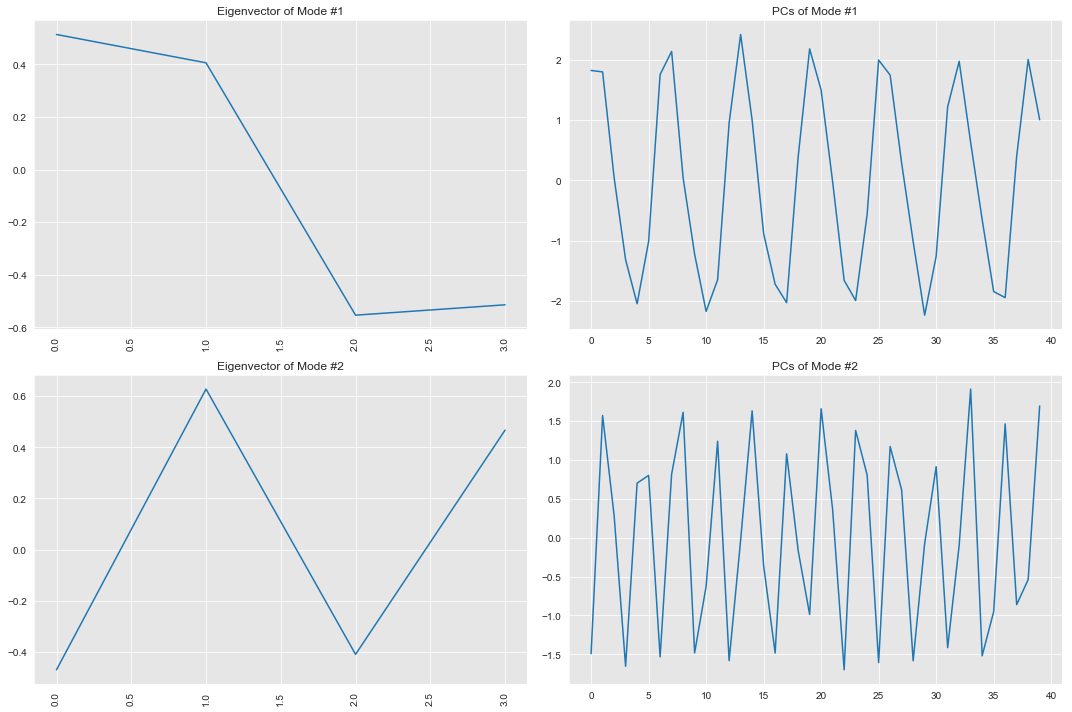
d) Plot the PCs of the significant modes (i.e. those that I kept) in time.
plt.figure(figsize=(15,5*n))
for kk in range(n):  # n here is = 2

    plt.subplot(n,2,kk*2+1)
    plt.plot(eigvecs[kk])
    plt.xticks(rotation=90)
    plt.title('Eigenvector of Mode #' + str(kk+1))

    plt.subplot(n,2,(kk+1)*2)
    plt.plot(PCs[:,kk])
    plt.title('PCs of Mode #' + str(kk+1))

plt.tight_layout()
Eigenvectors show the spatial patterns and PCs show the temporal patterns. So the first eigenvector plot for mode 1 which accounts for the highest variance, shows the change of variance over the spatial x domain explained by that mode.
The first PC plot for Mode 1 shows the temporal variance explained by that mode. Similarly is true for Mode 2, but for the second most significant mode. Overall Eigenvector 1 and 2 are orthogonal, and the PCs are uncorrelated. In this example the PCs show an oscillation through time.

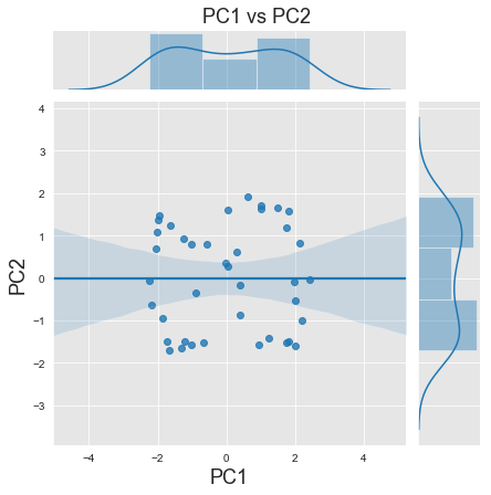
e) Plot PC1 vs PC2.
plt.figure()
g = sns.jointplot(PCs[:,0],PCs[:,1], kind='reg')
plt.xlabel('PC1',fontsize=18)
plt.ylabel('PC2',fontsize=18)
plt.subplots_adjust(top=0.93)
g.fig.suptitle('PC1 vs PC2',fontsize=18)
plt.show()
There are no defined clusters in this plot, and lowest spread or variance is in the centre. There is however a pattern of datapoints aligned towards the left and right corners of the plot, vertically. These edges have most variance too as seen in the plot. The points prove that the PCs are uncorrelated, however they are aligned in a bimodal cluster. Similarly there are pointy ends in almost all the 4 corners if looked closely.
